A kitchen journey in your pocket.
Designing interactions and customer journeys for Wren’s customer-facing app, as part of one connected digital ecosystem.
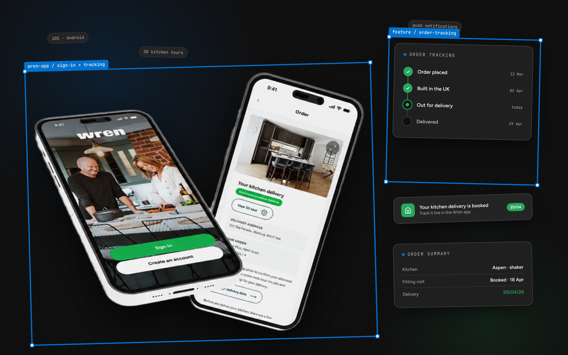
- Client
- Wren Kitchens
- Discipline
- Mobile App
- Role
- UX/UI and interaction design across the app
01 / The context
Part of a bigger journey
Customers don’t experience the app on its own — they move between it, the website and the showroom.
That made consistency with the wider digital ecosystem as important as anything inside the app. A customer should recognise Wren immediately, whichever screen they happen to be on.
02 / My role
Designing how it feels to use
My contribution centred on interaction design and usability: how screens respond, how customers move between steps, and where friction creeps into a journey on a small screen.
03 / Design decisions
Native where it matters, familiar everywhere else
Mobile journeys were designed around what a customer is trying to do at that moment, keeping each step focused and easy to complete with one hand.
Where the app needed patterns that behave differently from the web, they were designed deliberately rather than improvised — so the experience feels right on a phone without becoming a separate product.
- 01Customer journeys
- 02Interaction design
- 03Usability on small screens
04 / The system link
Part of one system
The app draws on the shared design system, so it stays aligned with retail, Trade and Contracts as the system evolves. As the system matures, patterns proven in the app are natural candidates to feed back into it — keeping the app evolving alongside the rest of Wren instead of drifting away from it.
Next project / Wren Trade & Contracts